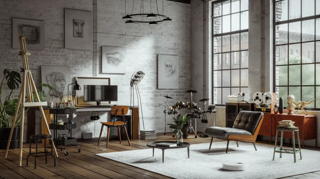
In fact, our home story begins with white. The world cooled, ages passed, whatever happened, happened and throughout all that time, in the homes of those eras, white was almost everything. It was clean, modern, bright. The walls were white, the ceilings were white, the kitchens were white, the bathrooms were already white… It was popular and risk-free because it guaranteed that a space was well designed.
Then gray arrived. More sophisticated, more urban, cooler. Yet over time, it too became rigid. Living among cold gray walls, although it looked good in photographs, began to create a sense of distance in the long run.
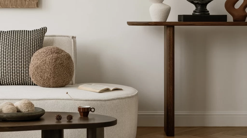
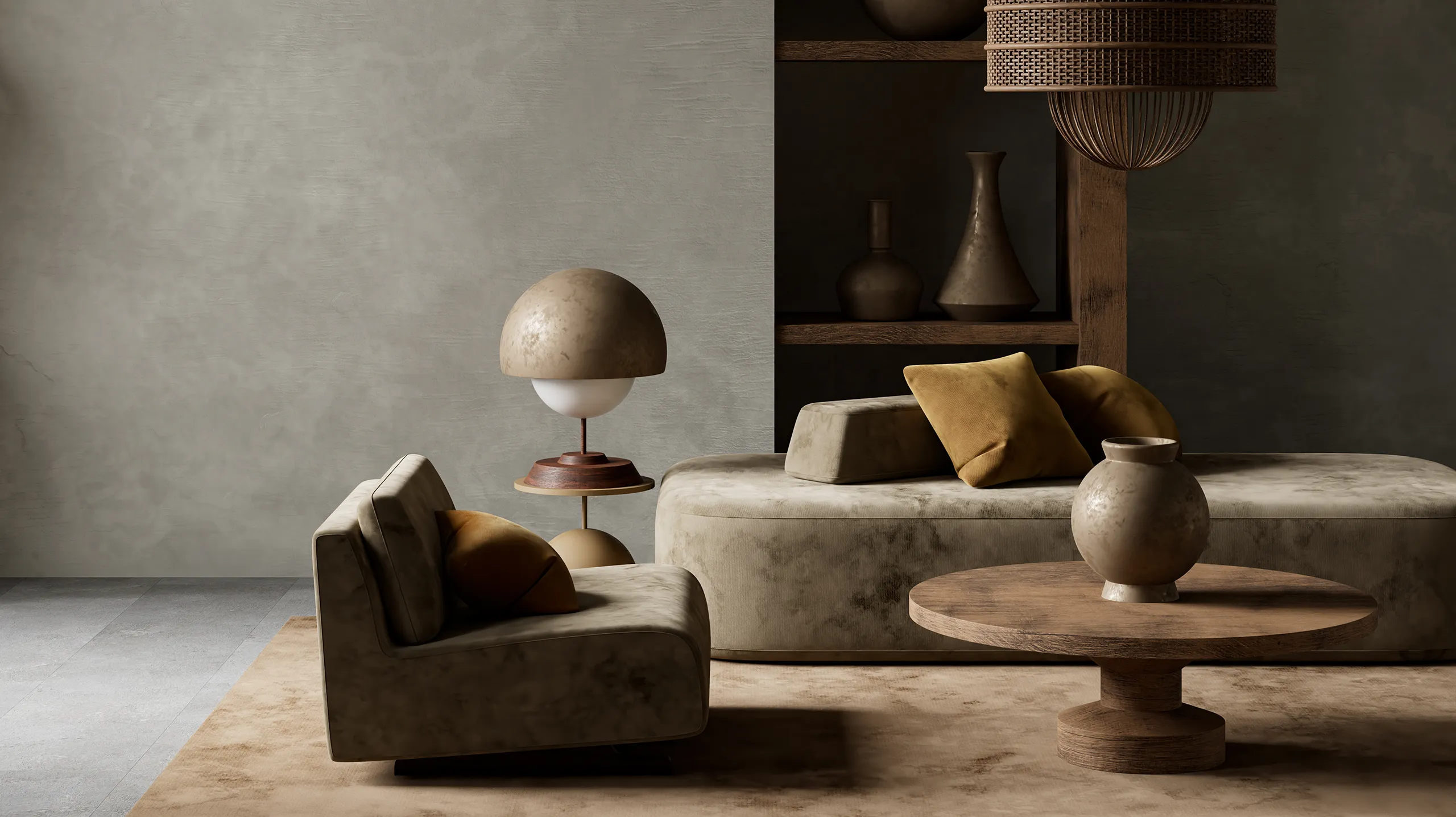
Now we are talking about another neutral tone. At first glance it may seem modest, yet it has the power to transform the entire mood of a space: earthy undertone beige. In some places it is called “greige,” elsewhere “clay beige,” or “warm stone.” But its essence is the same: a balanced neutral that carries both the discipline of gray and the warmth of earth.
WhY NoW?
In recent years, there has been a movement in residential design and decoration away from sterile whites toward more embracing and natural tones. Behind this shift lies not only an aesthetic preference but also a psychological need. Let’s consider this: earth tones are evolutionarily associated with safety. The human brain perceives colors frequently encountered in nature as more familiar and therefore safer. Earth-undertone beige touches this biological memory. It is neither dramatic nor theatrical, yet it gives the space a sense of “warm distance.” For example, when you enter a space, sometimes the first thing you feel is not the furniture but the color of the walls. If that base feels harsh, no matter how well designed the rest of the area is, a sense of distance forms. Earth-undertone beige reduces that distance. It makes the space more livable.
The INNeR StRucTuRe of The ColoR
The success of this tone lies in the fact that it is not pure beige… Because it contains gray pigment, it avoids falling into a yellowish nostalgia. At the same time, it carries subtle red or earthy undertones, preventing it from becoming a cold gray. In fact, the tone shifts according to light: in daylight it appears more natural and stone-like, while under warm evening lighting it takes on a more enveloping quality. This variability adds dynamism to the space. The color ceases to be a static surface and begins to accompany the rhythm of the day.
ITs SpaTIal EffecT
This tone neither shrinks a space nor dramatically enlarges it. In fact, its true magic lies in balance… Unlike a high-contrast white, it does not exaggerate volume, yet like a dark color, it does not narrow the area either. For this reason, it is especially ideal for urban apartments, medium-sized living rooms, and multifunctional living spaces. Light but not sterile, warm but not heavy. Perhaps that is why it is the most harmonious base color for contemporary minimalism.
One of this color’s strongest qualities is the relationship it builds with other tones. It softens black details while deepening dark wood. It makes stone and marble surfaces appear more natural, while highlighting textured fabrics. In other words, earthy undertone beige sets the stage — without stealing the role.
ITs EMoTIoNal LaYeR
Let us turn to the psychological reflections of this color: classic beige was long categorized as “safe but boring.” However, when the undertone shifts, perception shifts as well. Earth-undertone beige, though neutral, has character. Because it carries a subtle warmth, it feels more human. In truth, color is not merely a visual preference but also a neurological stimulus. The moment the eye perceives color, the brain sends a signal to the limbic system. In other words, color speaks directly to our emotional center. That is why when we enter a space and say, “I felt good” or “I felt tense,” it is often not only a conscious evaluation but also the rapid response of the nervous system. Earth-undertone beige occupies a particularly interesting position here: by not producing high contrast, it stimulates the brain less and allows the eye to rest. The heart rate slows, muscle tension decreases, breathing deepens. This color does not agitate the mind; it regulates it.
Perhaps what we need most today is not a dramatic color, but a balanced foundation. Earth-undertone beige is quiet, yet like a decisive actor. Not the leading role, but the key figure.
Amid the sharp contrasts of modern life, we create a transitional space with this tone. Between the sterile distance of white and the heaviness of dark shades, we establish a threshold that feels good to inhabit. We should remember that sometimes the strongest color is not the one that speaks the loudest, but the one that transforms by softening the atmosphere.